We try to stay away from the crowded fair itself, although I miss the satellite young designers corner.
In the following posts I'll give you my personal Salone favorites, and the things that hit my mind.
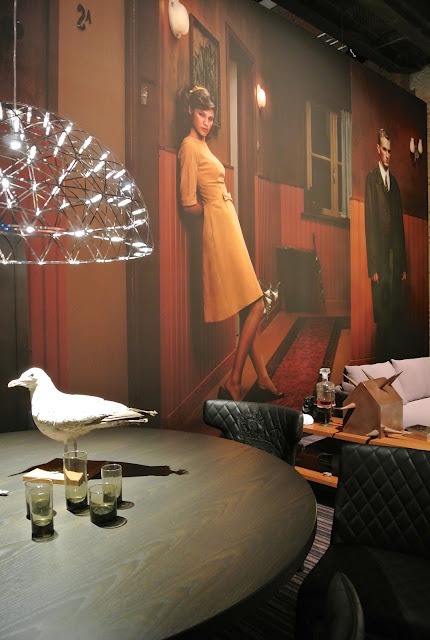
To be honest, the one exhibition that stayed top of mind after three days (and kept us for two hours hypnotized) was Marcel Wanders'show for Moooi, celebrating their life long collaboration with Dutch photographer Erwin Olaf.
I must admit, I'm all ready a big fan of Olaf, who's work is always controversial, über clean and off a breathtaking perfection.
Erwin Olaf is the house-photographer of Moooi, but what they present here is not the usual 'model-Moooi object in a fun, stylish combination'. NO. This time Moooi rented the biggest space in Zona Tortona and filled it with the most modern feel 'living room stories' in perfect harmony with Olafs work.

All the images, printed in a enormous size, take over each room and communicate with the story that is about to happen on the set. The models in Olafs gripping pictures are watching over the scenes, are interacting with the furniture and start to tell their very intimate, almost too private story in perfect silence. No words are spoken but you feel in each setting what story needs to get out.
Moooi's furniture is mooi (mooi is the dutch word for beautiful), but I had the idea to know it all, and wasn't expecting how it would fascinate me. Yes, we know the life size horse with the light fixing on it's head, we know the burned chairs and I love the larger than life lamp of Marcel Wanders.
But it's the way this enormous collection was presented that was so exceptional.
The fabulous styling!!!
Objects put together with such an style feeling that they set a brand new standard for design styling.
Thats the way I love it, thats the way we live: mix found, bought, self made and travel memory stuff with strange flowers, sneakers lying around, medicine and drinks, and you get the picture.
BEAUTIFUL. MOOOI.
Marcel was present. Off course. We crossed each other in one of his rooms and we smiled (we worked together on a project for Coca Cola where we used his human chandelier). He knew what I was thinking: "RESPECT Marcel! You nailed this one" and we smiled.
The story goes that when Wanders explained the concept to Erwin Olaf and send the wanted sizes for the images, Olaf mailed back to ask if he was sure about it and if there was no mistake.
I never seen Olaf's work so impressively presented (and we've all ready seen a few of his solo shows where the size of his pictures were always giant.)Impressive.
Studio Job signed for this bath thumb/bucket collection. Very Dutch, and blessed with really strong lines.
Small Delfts-blue ceramic handles and pure white shapes. Moooi.
Just fun to watch: the VIP area. Not the usual posh design objects, champagne and überstiff people. No, the VIP of Moooi was stuffed with cardboard boxes, in all shapes and taped for transportation.
Typical and stylish simple. As we know them as a brand, as a company.
Moooi, it was moooi!

© Photos Kate Stockman and Ivan Missinne


Our Heroes forever!! Fantastic, inspiring & everlasting!!
ReplyDelete